Tuesday, 20 December 2011

Audience Focus Group


Below is my Focus Group for the magazine, all of the girls fit into the category of my target audience (which can be shown in the blog post Audience Research) They will be the first five people to look at all the different aspects of my magazine and they will tell me what they like/dislike about it, the advise will be reliable as if they all like it, then it’s likely the rest of my target audience will as well as they all have the same interests as my target audience. Below shows some basic information about the girls and a short description of their interests and what thing/music they enjoy. 

Just to confirm, on the 16th December I asked all of the girls through mobile devises whether they will be in my focus group and all of them agreed. 

Target Audience


As shown in the collage that I’ve made, my magazines is challenging rock magazines, and so I am making my own ‘feminine rock’ magazines, which is aimed specifically at females. My magazine is going to have a state of sophistication however will be aimed at the younger generation, around 15-30 and would appeal to people in the B, C section. In the life-stage categories, my audience will be either ‘decision pending’ or the older section of ‘kids’ as they will be free to do whatever they desire and have not gotten to the stage of settling down yet, and are just focussing their life on having a good time, hence they would be hedonists. They will also a contrast between traditionalists, listening to some sorts of mainstream music, however also bordering on radicals as they have their own unique sense of music as well, which is rock. As shown on the collage, they will have a glamorous image, wearing lots of makeup, stylish clothing and listening to mainstream music; however they will also have an edgy look about them, to make them unique. They will like to sing along to rock music, on devises such sing along games and I Pods, they will also be attracted to good-looking people and they will like general mainstream things. 

Detailed Research in Forms and Conventions 2


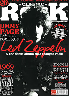
After looking at KERRANG magazine, I then did some research into a different rock magazine, which was 'Classic Rock.' I did this so I could research 2 different types of magazines hence giving me a variety of research into rock magazines, which will help when I come to doing my own. 

Classical Rock magazines don’t appeal to the same type of audience as KERRANG because although they are both about rock music they are aimed specifically at a niche market in that genre, the fact this magazines title is ‘classic’ rock automatically appeals to a more sophisticated and elegant audience, possibly some of the older generation as classics are sometimes very old songs, relating back to their youth yet also updating them on current rock bands and songs. Like most rock magazines, the word ‘rock’ in the title is very bold and clear relating it instantly to the rock music as it connotes loudness and volume, which imitates the rock music, in contrast to this, the ‘classic’ has a more subtle feel to it, as it is in a smaller and feminine font, the ‘classic’ is also in a darker greyish colour and overlaps the bold white ‘rock’, which in a way makes it stand out more than the rock does and making it prioritised even though the ‘rock’ is bigger and more visible. This could relate to the audience as although the main favourite genre is rock, a small guilty pleasure could be the classic side to it, as it could be slightly older and possibly not in fashion any more. Furthermore the title ‘Classic Rock’ appeals to the audience just because of the bluntness that it is a magazine which is about classic rock.

The colour scheme has 3 colours, white, black and yellow; I have noticed that many rock magazines have black and white in their colour scheme with one brighter colour to make the font stand out; in this instance classic rock has used yellow, and this colour is used repeatedly mostly to make the main points on the front cover stand out, for example the main stories down the right hand side. The fact yellow is used makes the magazine cover look very elegant as it complements the other colours in a subtle way, yellow isn’t a colour which is used to harsh standouts tones, although it is very effective in making things stand out subtly, the fonts emphasize this point, especially the ‘Frank’ as it has many flicks which makes it look less like a rock magazine as this doesn’t connote loud harsh rock music, but a more relaxed and quiet feel to it, relating to the ‘classic’ rock. In contrast to this, the cover stories to the bottom right of the magazine are quite bold, maybe reinforcing the idea that it is a rock magazine and still shows the latest rock bands as well as the old. The structure of the magazine cover, much like most of the other rock magazines I have looked at, is that the title takes up a large space across the top of the cover, making it easy to stand out and making the reader knows what to look for when buying the magazine, and making it easily recognisable. The photograph of an artist is then overlapping the title, however not to block the view of what has been written, (so you can still read it even though one letter may be overlapped or covered) most of the time, and in this instance, the main title of the magazine is the only text that the photograph covers.  The main cover story, which is about the artist in the picture, is then written above the middle of the page in quite a large font however no bigger than the title. The other stories are then placed quite low and to the side as not to interfere with the main story and the story the magazine feels can attract most of the audience, enhancing its importance compared to the other stories.

The photograph is of a ‘legend’ in rock playing his guitar, this is a good selling point to the viewers as mostly the picture takes the customers attention first, the fact that he is playing guitar which is a rock instrument may make people interested in what the content is about, this is because many people who are interested in rock music may also be involved in a band of their own and so musical instruments could appeal to the reader as they can relate to this. The way he is angled on the page is also affective as it splits up the two parts of writing; this makes them clearer as they aren’t squashed up on the same page, making it more appealing and easier on the eye.

The magazine features different articles including things like new albums from new artists, interviews and stories about rock music, all things that would appeal to the audience of people who enjoy rock music as the magazine is writing and aiming the articles and content of the magazine at people who are interested in rock music. They also give out free CD’s to try and gain more popularity and to convince the buyer to buy the magazine when it is shown and available in the shops, this makes the buyer feel like they are gaining something from buying the magazine, which really they aren’t because they are paying for it, however the fact ‘free’ is emphasised persuades the reader. The language used is very appreciative for the people that are described, praising them in phrases like ‘rock god’ this makes the reader get a vibe of what the writer expects to read when purchasing the magazine. As it is called classic rock all the language is appreciating the artists saying how great they are, people who buy the magazine will be able to relate to this as they aim the magazine at people who also like classic rock musicians, as the magazine is aimed at an older generation, unlike KERRANG, at around 35-50 years of age, when the rock musicians were at their ‘prime time’ this age group would have been going to all of their gigs and been young and big fans back in the day, so aiming the magazine specifically at the classic rock almost brings their audience back to their youth, however also keeping them up to date with the latest on what’s new in the world of rock. Much like KERRANG, the photographs are very formal with little facial expressions, in this one above, it is a very simple shot put in black and white and there is a shadow over half of his face, this enables a slight mystery to the artist which makes the reader more intrigued to read on, it also shows a sense of the rock classics music as although it may be different from the mainstream music, and more mysterious, it is still very appealing to this target market. 


DOUBLE PAGE SPREAD-


This double page spread for Classic Rock is again, very formal and civilized with little detail in the presentation, yet it still looks very impressive to the eye, this is because the picture connotes mystery, 
as he is looking away from the camera, this is made even more effective by the close up shot of 'John' as it makes the reader look directly at the man, without getting to know anything about him, hence why this would make them want to read on. Another way this is done in this article is by making the 'JOHN' stand out from the rest of the text, by making it extremely bigger and placing it on 2 rows, this simplistic method is easy on the readers eye, and the mysteriousness of the text also makes people want to read on. It also shows that the artist feels he doesn't need anything loud or colorful, and this could suggest that he standing alone is how he wants to be portrayed  possible suggesting his music is all that matters, not his image, this could relate to what the readers of the magazine also feel.  The black and white tones connotes maturity as though it is back in the olden day times and this could then bring the reader, which target audience is quite old, back to their youth in a very simplistic and effective way. The photograph takes up all of the one page in the double page spread and this could be to emphasis him, he is emphasized once more as he is alone, to show that he is very important, and he can stand alone and yet still look fine. The way the model/act is quite old and isn't amazingly good looking could relate the audience to him, as the target audience will be sort of the same age, and so they will feel they have a connection with him, enhancing chances that they will read the article. 

Monday, 19 December 2011

Detailed Research into Forms and Conventions


After deciding that I was going to do a feminine rock magazine, I did some further research into rock magazines, as this is the same type of genre, although I am challenging it slightly, it will give me a good inside as to what I should try and do when presenting etc

As I have decided my magazine will be a rock magazine, I am now going to write a 500 word analyses  about 2 rock music magazines to get a good idea of what would be appropriate and good for my own magazine.

The title of the magazine is ‘KERRANG’ and this itself imitates a big crash noise, the word kerrang is a onomatopoeic word as when smashing an electric guitar it sounds like ‘’ke-ranggg’ this links to the fact that the magazine is a rock magazine by imitating the genre’s own music instruments. When looking at it, the masthead is in a bold black font with an exclamation mark which again emphasizes the smash shock noise, and makes the title itself stand out from the rest of the text on the magazine cover. Once more to emphasizes the shock and rock look on the masthead, there are small white lines going through the writing which makes it look as though the writing has been smashed, almost like a window, it is also very recognizable and yet unique to the magazine; all of these connotations together link to the rock theme of the magazine as it makes it seem very loud, which ties into the rock music theme.

As said previously, the artists they interview/photograph are usually from the genre of music that the audience like to listen to: rock. This addresses the reader automatically as it could be a favorite band or a popular band member who attracts the audience (this person may usually be stood slightly ahead of the rest of the band, and possibly be wearing a different colour to make him/her separate from the other band members, enhancing his importance in the group) The photographs themselves are usually with the artists looking very serious and almost evil, which could connote a serious dedication to the rock theme as though they are very much into their music, relating to the music magazine itself. The artists aren’t very made up and look rather natural and in normal clothing, so nothing glamorous however the main guy standing in the middle has his hood up which could suggest he is trying to stand out in a simple yet affective way. The colour’s worn also tie in with the colour theme of the magazine, contrasting with their skin tones and hair colour’s making the artists very centralized and the main focus.

The magazine uses pictures of bands that are popular in the genre of music they specialize in, for kerrang this is rock and metal and so it is aimed at people who like listening to that sort of music. The artists are boldly presented in front of the masthead to make them stand out which will attract more people when selling in shops. Most magazines have a colour theme which carries on throughout the content pages , for this magazine it is red, white and black which are quite simple colour’s however when used together with the bright red is very effective and make the writing stand out making it easy to read and easy to catch somebodies attention. The colour’s could also imitate some sort of danger and anger which could represent the rock theme, and which could also make the reader feel drawn towards buying it for a guilty pleasure. The writing style used is big and bold for the main story to draw the attention to their main story that week, which will hopefully help to sell the magazine, whereas the other stories are in a smaller font however they are still very bold which relates to the rock theme of the magazine as many rock artists are big and bold in their image and when it comes to their music. Most of the information about what’s inside the magazine is at the bottom of the cover, leaving plenty of room for the main cover story and like most of the other magazines the masthead is along the top of the magazine.


The language used on the cover of kerrang is very simple and basic, they don’t want to use very intelligent wording as their audience doesn’t tend to be people who know the dictionary from back to front, and are more just care-free and like rocking out, another reason the language isn’t too complicated is that if people don’t understand what’s written they will be less inclined to buy the magazine. So instead they use word’s like ‘massive’ which is still very affective in the contest that it is used in. The cover has as little writing as possible to tell the reader what is going on inside the magazine without giving away every detail. They use capitals a lot, for example ‘FREE!’ which helps emphasize that they are giving something away for free which is a big seller when it comes to magazines. It also makes that small piece of text stand out well with the exclamation mark as it is by itself and so usually wouldn't have been noticed as much. 


The content of the magazine has lots of other types of rock bands, that aren’t there main story, like their cover story however they are still featured in the magazine in things like articles, interviews, photshoot’s, reviews etc.. This is good publication for the band and it also attracts the magazines audience as the bands genre of music is the type of music kerrang is aiming their magazines audience at. They also give away things, for example in this issue they give away a free poster and they are having a download ticket give away.  This attracts more people to buy the magazine because if they like what they get back in return for buying it they will be more inclined to do so.

Because Kerrang specialize in a small sector of the music industry they have a niche market of people who are interested in or like listening to rock and metal music. Because of the fonts, presentation, set out and colour’s it could be apparent that it is aimed at the younger generation however this is only an opinion.

Kerrang is published by Bauer Consumer Media which is a worldwide publishing company, they do not only own Kerrang, but also some other huge magazines such as FHM, ZOO, Heat, Q and so many more, along with TV and radio stations worldwide which makes them part of a multi-national conglomerate. They started as just a rock magazine and when the rock industry came to a low they added some metal into the magazine as well,  this shows that the ownership structure of the magazine accounts for it’s success as they are good at adapting to change yet still selling the product to ensure they get a good profit, there ownership may also be a big reason as to why the magazine has become so successful as many popular rock acts have been featured in the magazine which could have come about through their ownership. The magazine is now the worlds biggest selling weekly rock magazine and the cost of the magazine is £1.99 which could suggest the ownership values their customers as they want to sell their magazine for a decent price. 

‘Kerrang! identifies its audience as ‘individually minded, independent of thought and musically experienced, an audience defined by attitude, passion and loyalty’. Kerrang distinguish their identity as a world ‘where Jackass meets Play station and Skate culture meets IPod’

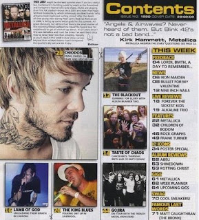
At the top left of the contents page is a small picture of the front cover of the magazine and a short paragraph written by the editor, describing what inspired them to put the things they put into the magazine, what they like about the music, and what they are trying to achieve by the magazine that particular week. Many magazines, not just music, have an editors column  and this just helps the reader to connect more with what is going on in the magazine.

This contents page has a lot of pictures which illustrate what the features inside the magazine will be about, and it also helps to catch the readers attention, because of this, they take up the majority of the page, the bigger images suggest that they will be the bigger stories, so perhaps are more important.  

Content is clearly visible in bold and bright writing to make it stand out from the rest of the writing on the page, and this is simply to tell the reader what the page is doing, (telling them what is in the magazine, and where to find it.)

The photographs are also labeled which shows the reader a small clip of what may appear in the magazine, it also gives them the opportunity to find them in the magazine if they are unfamiliar with the artist and want to find out more.

Down the right hand side of the page it tells you specifically where everything is by page numbers, and it also splits each section up so it is even easier to find what you are looking for, they do this by putting small titles above each different section which are contrasted on a different colour background, and they are also in capitals and a bright yellow colour, for example, ‘NEWS’


This double page spread is about the All-American rejects.
Some of the pictures are black and white and have a red line around each of them which makes them all look very effective as it makes them stand out a lot compared to the writing. In those pictures, it is almost 3D as they are coming out of the ‘frames’ which looks really good for the audience and it makes it feel more interactive. 
The spread is split pretty much in two by photographs and writing, the writing being an interview. There is more than one picture, and this is done so that the bigger picture shows you all of the members together, and the others showing smaller separate pictures of each member, this helps you to get to know each member individually, helping the reader to relate to them. 

There are a few quotes in reversed out cover lines, and this helps emphasize what he says, usually this is a funny or interesting point which makes people want to read on.
The colour scheme is the same throughout the spread, a red purple and black theme, and like the cover, the photograph links in with this theme.
The dirty little secrets is the bigger and more interesting font, as the fonts are different, contrasting the feminine ‘dirty little’ with flirty fonts, and the ‘secrets’ with a bold scruffy font which suggests something really secretive is about to come out in the interview. The test is all interview, and talks to the band  about their private lives, what’s gong on with the individual members, and the band a as group., basically anything that will get the audience gripped and wanting to read about.


Wednesday, 14 December 2011

Time Management

Above is a time line in text form showing when I plan to finish each of my tasks for the Planning and Research section of the project, below shows the time-line, this is so I can make sure I keep up to date with what I plan to do.


Thursday, 8 December 2011

Initial Research: Genre


I started my research by looking at all the different types of music magazines that were available and what each magazine specialised in so I could then find a gap in the market for my magazine, I made a Prezi to show what I found out, and what I plan to base my magazine on.

Tuesday, 29 November 2011

Main Task: Magazines

The coursework brief is to produce the front page, contents and double page spread of a new music magazine, all of the images and the text must be original and produced by myself, with a minimum of four images.
DEADLINES:
Research and Planning to be finished for 20/12/11
Production to be finished to 03/02/11
Evaluation to be finished for 24/02/11

Monday, 28 November 2011

Targets


When evaluating I used word instead of using a presentation which showed proficient use of ITC, and so in my proper task I will take more time to present it in a better way and I will include pictures and arrows.
I am going to try and cover more of the mark scheme when I write what I plan to do and I will put in more evidence of research.
I will take the picture with a background that I want so I don't have to photo-shop the background as much as that made the overall magazine a little tacky and not professional.
In my evaluation I will try and cover more of the mark scheme as I left a few bits out which could have increased my marks. 

Friday, 21 October 2011


Evaluation
My magazine was called ‘Student Social’ as it is primarily aimed at students who are very social and wants to know what is happening in and around Worcester. The fact that it has the word social in the name of the magazine instantly attracts people who are social people drawing them into the magazine and as it has student in it as well it shows that the magazine is aimed at students, targeting my main audience of social students. The font and style of the masthead isn’t amazingly attractive to the audience as it is quite subtle in the way that it is in quite a regular font, this is because it is quite an easy title so its not the only thing that catches the audiences eye on the cover of the magazine as I wanted the stories about what was in the magazine to appeal to the audience more as then they would feel more obliged to open it and read on, however the background of the masthead changes from the background of the picture to black squares; and as the writing is bold and white the occasional blackness makes the ‘social’ stand out a lot more;  the black and white feel almost gives a strobe light affect which then attracts people who like to party as it’s like an on-off colouring thing, again linking it to a strobe light, or some other sort of disco lighting. This technique is followed through to the rest of the magazine as a lot of the magazine has different colour squares giving the magazine an edgy feel to it, appealing more to the more edgy people, who are hedonists and just want to have a good time.
The cover star on the front of the magazine is a usual every day student which instantly draws other students in as she isn’t somebody who has been made up to look ‘perfect’ like some celebrities are on other magazines such a vogue, which makes a relationship with the audience as it makes them feel like they can relate to her. She is smiling in the picture which also makes her more welcoming; the sun is lit specifically onto one of her eyes and her forehead and as she is looking directly at the camera this brings a sense of welcoming to the audience as she look very friendly.
She is wearing a red clip on broche which relates to the colour theme of red black and white which links her to the theme of the magazine much more, and makes the magazine look quite smooth as everything flows quite nicely; maybe making it easier and more enjoyable to look at. The colour red itself brings a sense of danger and excitement to the magazine cover and so this colour suggests the magazine will be an exciting read, it also shouts out to my audience as they want to have a good time, being dangerous or outrageous; and as it’s a social magazine it will tell people what there is to do around the area in order to be dangerous and outrageous. The contrast of the white and black and red is also quite effective as it jumps from one colour to the other quite quickly, this could suggest that my audience are young and free as the different blocks of colour are quite big and bold, maybe suggesting my audience are big and bold characters, relating them more to the magazine, hence will make the magazine more linked to them, jumping from different colours can also represent the disco lights theme again, which makes the reader think of parties which is initially what the magazine is about; and for people who like to party, so this is linked more towards my audience there as well.
Throughout the magazine cover as a whole, the main colour theme is orange, black, red and white, I chose these colours as although you could say that black and white are very standard colours, I think that with the bright colours of red and orange it contrasts very well to add a very modern feel to the magazine cover. Furthermore, the orange and red contrasts in itself as these two colours are very similar, yet contrast quite well. The aim of the modern feel to the magazine is so that it appeals to the audience and is quite eye catching, which will then mean they then go on to read the stories, selling more copies of the magazine, which is initially the aim of the game in the industry.
The stories I used for my magazine cover are much like most other student magazines in that they are related to students very well, for example one of the stories is about learning how to drive, it is highlighted by the fact that there is a ‘L’ plate to start the sentence, which instantly makes people think of driving, and as the age that you can start driving is 17 many 17 year olds are thinking a lot about this and it will appeal to a lot of students; as it is also a competition, this makes the reader want to apply for it as they can get some free lessons, meaning the magazine will help them in some way, financially.
Other stories include ‘what’s on in Worcester’ I think this is one of the most effective pieces of the magazine cover as the different colour outlines make the writing stand out very well; and the red and black together make the reader think of excitement, yet danger and thrill at the same, they are also slanted in different directions which can suggest that there is information all around Worcester about different things, from the good clubs to go to, to the nearest theatre, again attracting the audience to know what’s going on in the city.
In the stories the fonts vary quite a lot so that the cover never gets boring to look at and it makes it quite interesting for the viewer who will hopefully then go on to buy the magazine. There are some bold words, such as ‘win now!’ and this along with the exclamation mark adds a sense of urgency to the competition, making the customer more excited to sign up. Some of the other stories are written in a more italic style writing, for example the ‘Laugh out LOUD’ I did this because ‘LOL’ is what people usually say in a more slang sort of speech, and as this is a student magazine and students speech includes a lot of slang, so if you look closely the laugh out LOUD, when looking at it downwards, says ‘loL’ which then enhances the Loud at the end, encouraging people to read on as they are really funny jokes, making them laugh a lot, or as said: loud.

Technology
To make my cover, firstly I used the internet to do my research about what other students magazines have in and on them, such as stories, features and designs. I then used my own digit camera and put the pictures onto the computer using the memory card; I then uploaded the photos into Photoshop and started designing the cover of my magazine. All the types of technology I used were very useful, for example putting the pictures onto the computer by putting the memory card into the memory card drive in the computer, and then saving them onto the computer took about five minutes and so the whole process was very quick and efficient. Photoshop was also very good to use, as I have used it before in my Media classes at school so I already knew the background of the programme, and inserting writing, cropping and editing are all very easy to do, in a very effective way.
Photoshop was used in many ways while making my cover magazine, the most effective and helpful thing that it offered was all the different layers as it enables you to change things that are maybe underneath something else, yet to be able to keep the thing on top. Especially after naming my layers it was a very easy way to get around all the tools and things that happen in Photoshop.
Blogging helped me keep track of the work I did easily and quickly, and I enjoyed working on there; the only problems where when uploading things to the blog, is that whereas I do a lot of work in word and you need to upload things onto the blog in a JPEG (well this is the easiest way to upload things) and so sometimes it was confusing print screening and then cropping and then saving just to get the writing into the format that could be saved onto the blog. However, when the work was finally uploaded, it was presented in a clear way, and the research and the work that I’d done was easily accessible and easy to change or add on.
The technology used didn’t confuse me as I’m quite familiar with most of it, although I wasn’t with blogger, however it’s not overly complicated and so it was easy enough to catch on quite quickly. 

https://blogger.googleusercontent.com/img/b/R29vZ2xl/AVvXsEiKKwjg6onEylV3TxyDTy5PJgqSjIKExyuwjqmEJCkbAR0QPFHfb-8LhS45j1KhpO7xPGNu51JtlN-OAE4u6ICupRJGISCQsu2uA69zODHWTD8FlBE-0IPEt4ThxbMB55mMupYjwY9LrAo/s320/student+social+cover..jpgEvaluation
My magazine was called ‘Student Social’ as it is primarily aimed at students who are very social and wants to know what is happening in and around Worcester. The fact that it has the word social in the name of the magazine instantly attracts people who are social people drawing them into the magazine and as it has student in it as well it shows that the magazine is aimed at students, targeting my main audience of social students. The font and style of the masthead isn’t amazingly attractive to the audience as it is quite subtle in the way that it is in quite a regular font, this is because it is quite an easy title so its not the only thing that catches the audiences eye on the cover of the magazine as I wanted the stories about what was in the magazine to appeal to the audience more as then they would feel more obliged to open it and read on, however the background of the masthead changes from the background of the picture to black squares; and as the writing is bold and white the occasional blackness makes the ‘social’ stand out a lot more;  the black and white feel almost gives a strobe light affect which then attracts people who like to party as it’s like an on-off colouring thing, again linking it to a strobe light, or some other sort of disco lighting. This technique is followed through to the rest of the magazine as a lot of the magazine has different colour squares giving the magazine an edgy feel to it, appealing more to the more edgy people, who are hedonists and just want to have a good time.
The cover star on the front of the magazine is a usual every day student which instantly draws other students in as she isn’t somebody who has been made up to look ‘perfect’ like some celebrities are on other magazines such a vogue, which makes a relationship with the audience as it makes them feel like they can relate to her. She is smiling in the picture which also makes her more welcoming; the sun is lit specifically onto one of her eyes and her forehead and as she is looking directly at the camera this brings a sense of welcoming to the audience as she look very friendly.
She is wearing a red clip on broche which relates to the colour theme of red black and white which links her to the theme of the magazine much more, and makes the magazine look quite smooth as everything flows quite nicely; maybe making it easier and more enjoyable to look at. The colour red itself brings a sense of danger and excitement to the magazine cover and so this colour suggests the magazine will be an exciting read, it also shouts out to my audience as they want to have a good time, being dangerous or outrageous; and as it’s a social magazine it will tell people what there is to do around the area in order to be dangerous and outrageous. The contrast of the white and black and red is also quite effective as it jumps from one colour to the other quite quickly, this could suggest that my audience are young and free as the different blocks of colour are quite big and bold, maybe suggesting my audience are big and bold characters, relating them more to the magazine, hence will make the magazine more linked to them, jumping from different colours can also represent the disco lights theme again, which makes the reader think of parties which is initially what the magazine is about; and for people who like to party, so this is linked more towards my audience there as well.
Throughout the magazine cover as a whole, the main colour theme is orange, black, red and white, I chose these colours as although you could say that black and white are very standard colours, I think that with the bright colours of red and orange it contrasts very well to add a very modern feel to the magazine cover. Furthermore, the orange and red contrasts in itself as these two colours are very similar, yet contrast quite well. The aim of the modern feel to the magazine is so that it appeals to the audience and is quite eye catching, which will then mean they then go on to read the stories, selling more copies of the magazine, which is initially the aim of the game in the industry.
https://blogger.googleusercontent.com/img/b/R29vZ2xl/AVvXsEiKKwjg6onEylV3TxyDTy5PJgqSjIKExyuwjqmEJCkbAR0QPFHfb-8LhS45j1KhpO7xPGNu51JtlN-OAE4u6ICupRJGISCQsu2uA69zODHWTD8FlBE-0IPEt4ThxbMB55mMupYjwY9LrAo/s320/student+social+cover..jpgThe stories I used for my magazine cover are much like most other student magazines in that they are related to students very well, for example one of the stories is about learning how to drive,  as seen in the image to the right, it is highlighted by the fact that there is a ‘L’ plate to start the sentence, which instantly makes people think of driving, and as the age that you can start driving is 17 many 17 year olds are thinking a lot about this and it will appeal to a lot of students; as it is also a competition, this makes the reader want to apply for it as they can get some free lessons, meaning the magazine will help them in some way, financially.
Other stories include ‘what’s on in Worcester’ I think this is one of the most effective pieces of the magazine cover as the different colour outlines make the writing stand out very well; and the red and black together make the reader think of excitement, yet danger and thrill at the same, they are also slanted in different directions which can suggest that there is information all around Worcester about different things, from the good clubs to go to, to the nearest theatre, again attracting the audience to know what’s going on in the city.
In the stories the fonts vary quite a lot so that the cover never gets boring to look at and it makes it quite interesting for the viewer who will hopefully then go on to buy the magazine. There are some bold words, such as ‘win now!’ and this along with the exclamation mark adds a sense of urgency to the competition, making the customer more excited to sign up. Some of the other stories are written in a more italic style writing, for example the ‘Laugh out LOUD’ I did this because ‘LOL’ is what people usually say in a more slang sort of speech, and as this is a student magazine and students speech includes a lot of slang, so if you look closely the laugh out LOUD, when looking at it downwards, says ‘loL’ which then enhances the Loud at the end, encouraging people to read on as they are really funny jokes, making them laugh a lot, or as said: loud.

Technology
To make my cover, firstly I used the internet to do my research about what other students magazines have in and on them, such as stories, features and designs. I then used my own digit camera and put the pictures onto the computer using the memory card; I then uploaded the photos into Photoshop and started designing the cover of my magazine. All the types of technology I used were very useful, for example putting the pictures onto the computer by putting the memory card into the memory card drive in the computer, and then saving them onto the computer took about five minutes and so the whole process was very quick and efficient. Photoshop was also very good to use, as I have used it before in my Media classes at school so I already knew the background of the programme, and inserting writing, cropping and editing are all very easy to do, in a very effective way.
Photoshop was used in many ways while making my cover magazine, the most effective and helpful thing that it offered was all the different layers as it enables you to change things that are maybe underneath something else, yet to be able to keep the thing on top. Especially after naming my layers it was a very easy way to get around all the tools and things that happen in Photoshop.
Blogging helped me keep track of the work I did easily and quickly, and I enjoyed working on there; the only problems where when uploading things to the blog, is that whereas I do a lot of work in word and you need to upload things onto the blog in a JPEG (well this is the easiest way to upload things) and so sometimes it was confusing print screening and then cropping and then saving just to get the writing into the format that could be saved onto the blog. However, when the work was finally uploaded, it was presented in a clear way, and the research and the work that I’d done was easily accessible and easy to change or add on.
The technology used didn’t confuse me as I’m quite familiar with most of it, although I wasn’t with blogger, however it’s not overly complicated and so it was easy enough to catch on quite quickly. 

Friday, 14 October 2011


These are my final pages for my front cover and my content page, I made them using Photo shop Pro.

Friday, 30 September 2011


After I completed my risk assessments I drew out a plan of what my content page and cover page will look like, so when I have taken the pictures and I am ready to start making my magazine it will be planned and I will know what I need to do. The plans of both the cover page and the content page are above:

Wednesday, 28 September 2011

Next I designed a risk assessment to make sure all it will be safe to take all of my photographs and no models will be harmed during the shoot, this is shown below:


Next I planned when, what and where all my pictures where going to consist of:

I then did a similar thing but with Content pages instead of the Covers of magazines, this is what I found out: 


Tuesday, 27 September 2011

Initial Research 2

I then looked at what we found about the different styles and conventions in different types of magazines and wrote about how this attracts the audience; again this is what I found out: 


Initial Research

We started of the task by looking at a number of different student magazines so I could find out what the different types of conventions are in different types of student magazines, and some of the things that are similar in the magazines. This is what I found out:


Tuesday, 20 September 2011

Preliminary Task

Hello and welcome to my blog :) ..I am going to be uploading all of my AS Media Studies coursework to this page and my first piece is to design a student magazine cover and contents page. Make sure you follow!! :D xxxx