I took all of my photographs on a Fuji Fine-pix S2950 which has a wide angle lens, 14 megapixels and 18 x zoom; to upload them onto the computer, I simply took the memory card out of the camera and inserted it into the computer I was working on. I then went to Start, Computer and it appeared under my Hard Disk Drives. I then clicked on this file, and copied the pictures I needed into My Documents, allowing me to access the pictures on any computer.
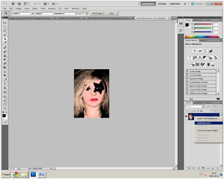
To darken the images of my cover model, giving the magazine a more edgy, darker and therefore 'rock' look, I drew a box around what I wanted to edit, clicked on effects, and then brush strokes on one and sumi-e on the other which created the dark, mysterious look.
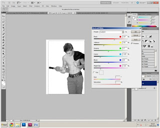 I also changed the colour of my double page spread model to make him black and white, to add a more classy yet rock-like tone to the magazine. I did this by creating a box around the model and adjusting the colour tone, I could lighten and darken the tone to whichever preference I preferred. As you can see in my image, I have also cut out the model from the original picture so he is stood alone with no background and I did this by using the Magic tool, and it cut around him perfectly making him a single image.
I also used some other websites to help put my research and planning together, one was Slide Share and the Other was Timeline.
Slide Share
Time toast was used pre planning and researching for my magazine as it allowed me to create an interactive time line to show when I needed each task to be completed by, this made it easy for me to see where I was up to in the process of creating my magazine and when I needed to complete each task by. This made me stay on track with each task, and allowed me to reach all of my deadlines. Again it was very easy to create my time line, as I just edited the time zone which the magazine had to be created in, and what needed to be done at each date, I then saved this and copied the embedded code into blogger.com - much like I did with slide share.
Facebook
My focus group was based on Facebook and I got many Private mails through Facebook from my focus group telling me what they thought of certain things I had created, any ideas they may have had etc, I also planned when I was going to meet my models on here. To upload this information on my blog I simply print screened the messages.
The camera was very important when I was capturing the images so that the standard and the quality of the pictures were that of a real magazines, the fact I was able to get them onto the computer and then access them quickly and effectively saved me a lot of time and made the whole process a lot easier and made it run a lot smoother.
Adobe Photoshop
I made my front cover in Adobe Photoshop as I have used this before at high school and so new the basics of what I was doing to get me started. First, I went to file, new, and created an A4 blank page, for the basis of my front cover. I then imported the picture that I was going to use for the cover. I had to duplicate this layer, which is shown in the picture below, this was so I could get the title of my magazine behind the cover model, to get the real affect of a real magazine. Which can be seen on the right. I did this by right clicking the layer, and clicking duplicate. I did this various times during the production of my magazine with a few different photographs.
To darken the images of my cover model, giving the magazine a more edgy, darker and therefore 'rock' look, I drew a box around what I wanted to edit, clicked on effects, and then brush strokes on one and sumi-e on the other which created the dark, mysterious look.
 |
| BEFORE |
 |
| AFTER EDITED |
 |
| AFTER EDITED |
 I also changed the colour of my double page spread model to make him black and white, to add a more classy yet rock-like tone to the magazine. I did this by creating a box around the model and adjusting the colour tone, I could lighten and darken the tone to whichever preference I preferred. As you can see in my image, I have also cut out the model from the original picture so he is stood alone with no background and I did this by using the Magic tool, and it cut around him perfectly making him a single image.
InDesign
After making my model black and white in Photoshop, I then needed to transfer him into InDesign so I could create my double page spread. To do this, I duplicated the layer, (as shown above) and dragged the duplicated layer into a blank InDesign Document.
When in InDesign, I needed to wrap the text around the image so that the writing would go around the image and not under or over it, I did this effect by clicking on text wrap which is on the right hand side, and selecting 'wrap around object shape' which created the very magazine look-a-like effect of the article.
 InDesign also had many other features which I could use to make my magazine look efficient and realistic, such as import artistic fonts from the internet, create reversed out cover lines to enhance a statement and make it more clear, write the text in clear columns and create interesting backgrounds to make the double page spread look more captivating, which is what I've done on my finished piece, shown to the right.
Blogging
As I researched magazine's, and then went on to produce my magazine, I blogged my progress on Blogger.com which is a very useful and efficient site that kept me up to date with what I was doing, when I was doing it, and when I had to complete tasks by.
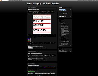
I updated every stage through the process of producing my magazine, which included showing my work to my focus group and collecting audience research and decisions which were made, and the reasoning as to why they were made, an example of the blog can be seen in the photograph. It was very easy and quick to upload a new blog post, as all you had to click,'New Post' It was also easy to add photographs, change colours and fonts,and also create bullet points, paragraphs etc as all the options are set out clearly along the top bar. To embed something was also easy, as all you has to do what get the embedded code, click HTML instead of Compose, and copy in the embedded code. - I did this for videos and time-lines etc. Not only did it help me keep track of what I was doing, but it also helped me keep track of what I've learnt as I can refer back to my earlier work quickly and easily, and it is sectioned into each different month and year I updated the posts, so I can get to where ever I need to get on my block easily. - for the same reasons, I feel Blogger.com helped me present my research and planning in a clear and coherent way.
I also used some other websites to help put my research and planning together, one was Slide Share and the Other was Timeline.
Slide Share
SlideShare was a website which I mainly used to create a stimulating and interactive evaluation, it is a site that allows you to turn power point's into a short movie and then embed it onto my blog, this is very quick and simple, as all you need to do is click 'upload' and find the file you wish to upload onto the website to therefore create a movie-like power point in order to share it, and copy the embed code into blogger.com. a screen shot of this is below:
My focus group was based on Facebook and I got many Private mails through Facebook from my focus group telling me what they thought of certain things I had created, any ideas they may have had etc, I also planned when I was going to meet my models on here. To upload this information on my blog I simply print screened the messages.
YouTube & Adobe Premiere Pro
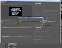 In the evaluation of my blog, particularly in question 5 and question 7, I have embedded a video of either myself, my focus group or other students at college, so that I have answered these questions in a more interactive and interesting way. To do this, I firstly created the video, by also adding titles describing who was speaking and why in Adobe Premiere Pro, I then saved this, and then exported it into a FLV file in order for me to then upload in onto youtube. This can be seen on the right.
 In the evaluation of my blog, particularly in question 5 and question 7, I have embedded a video of either myself, my focus group or other students at college, so that I have answered these questions in a more interactive and interesting way. To do this, I firstly created the video, by also adding titles describing who was speaking and why in Adobe Premiere Pro, I then saved this, and then exported it into a FLV file in order for me to then upload in onto youtube. This can be seen on the right.
Next, I had to uplaod this on my youtube account, and then click on embed, so it gave me the embed code, which I could then easily copy onto my blog, like embedding anything else I had to click on the 'HTML' button instead of teh 'Compose' button when embedding a file onto my blog.
- all of this technology had enabled me to create a very interactive and interesting blog, and I think it helped me to make my blog different, and also to get my points and ideas across in a easier and more effective way, which also makes it easier for people looking at my blog to understand it. So overall, I think the technology that went into my blog post and the process of producing the magazine was very successful and helpful.


No comments:
Post a Comment